Confined
“The forms of art are inexhaustible; but all lead by the same road of aesthetic emotion to the same world of aesthetic ecstasy.” –Clive Bell
For Clive Bell, the determination of a good art piece was not in its technical skill, or in its ability to invoke emotions by connotation, but instead by the emotions the arts form invoked. This is a major reason why he was so fond of abstract and non-representational art.
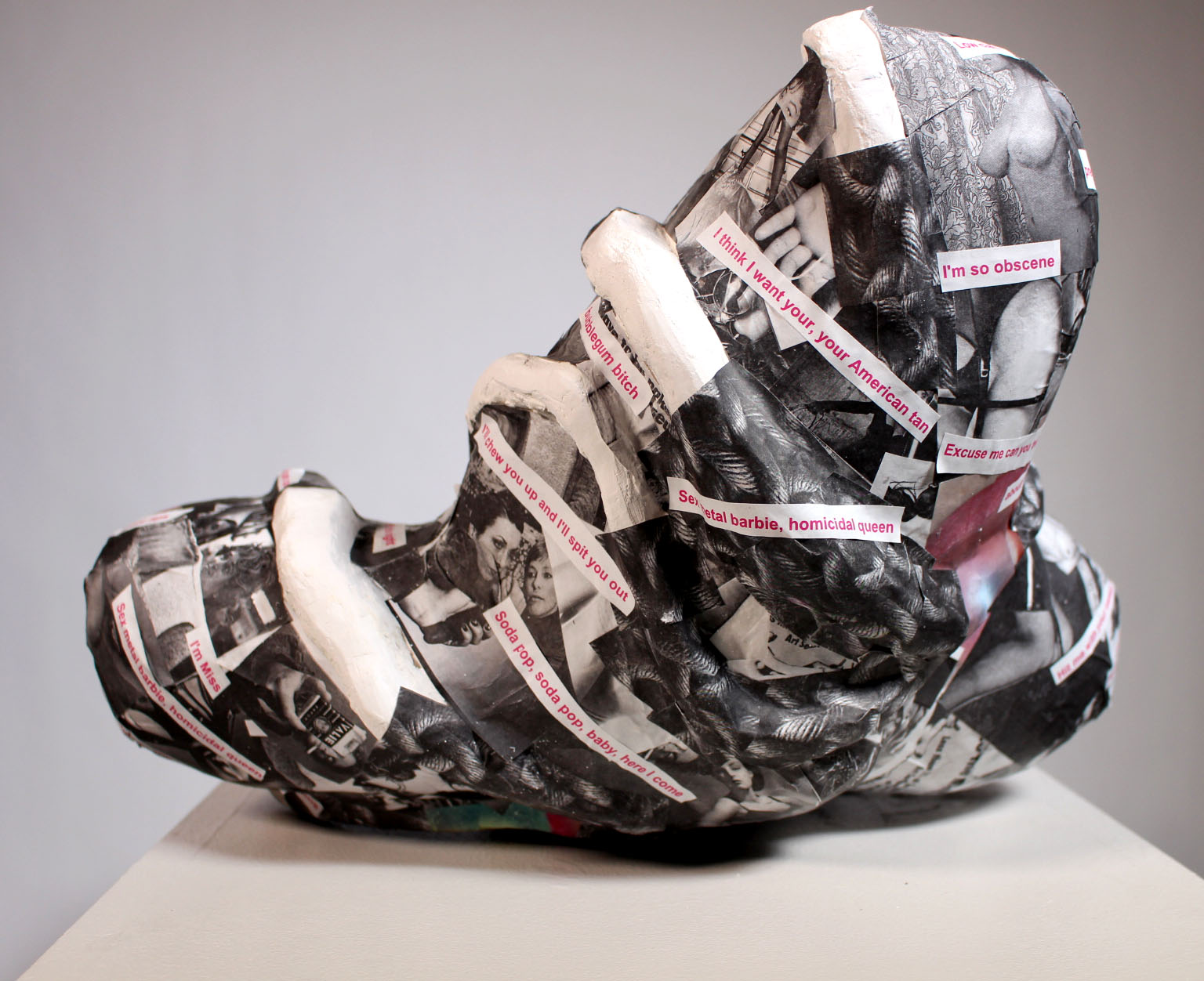
Bell’s ideas surrounding Aesthetic Responses and Significant Form was the base line that this piece was built off of. The goal of the work was to create a 20-inch non-representational sculpture and then to add a representational graphic element.
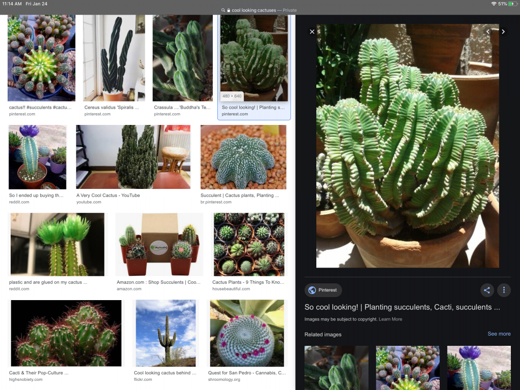
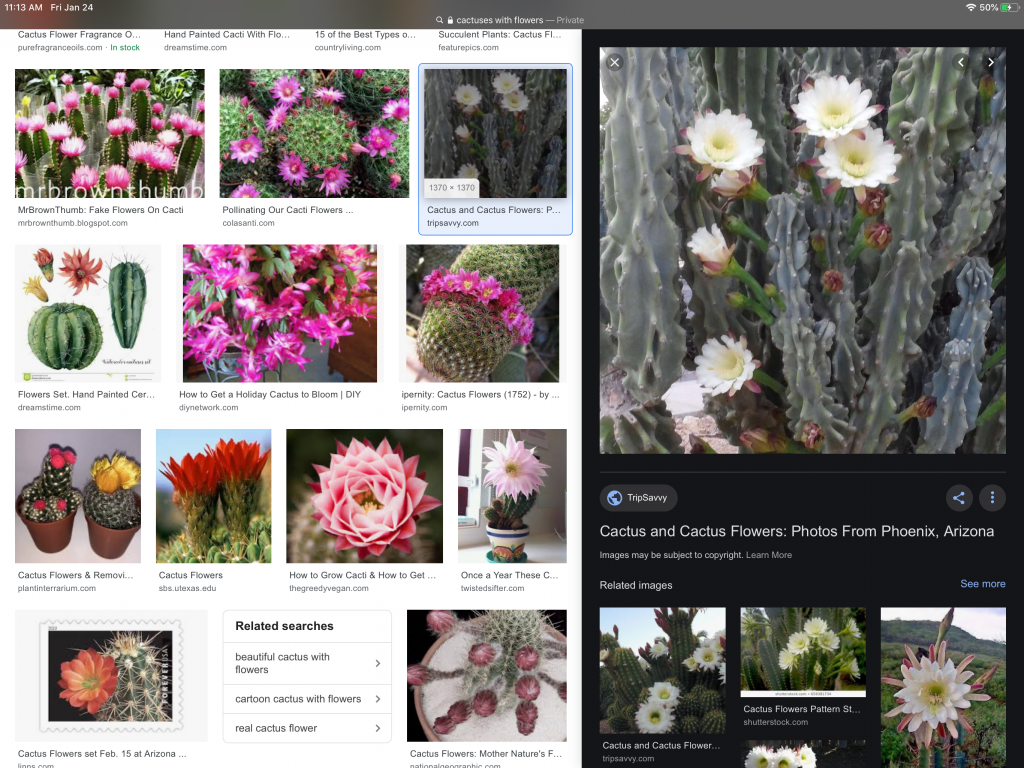
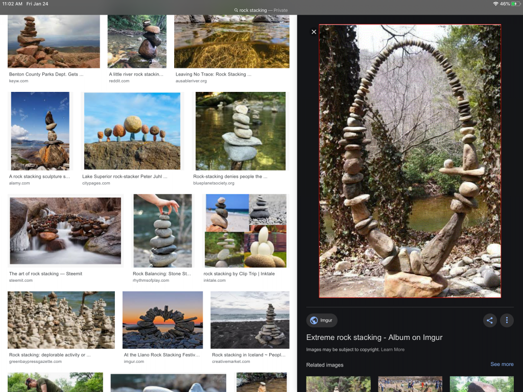
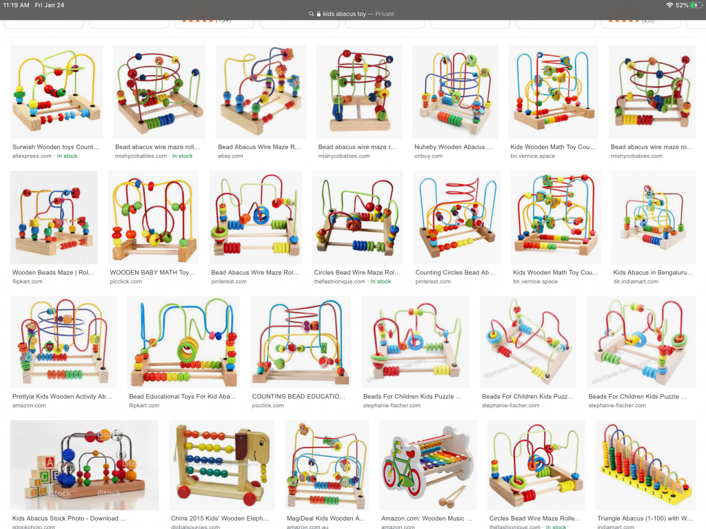
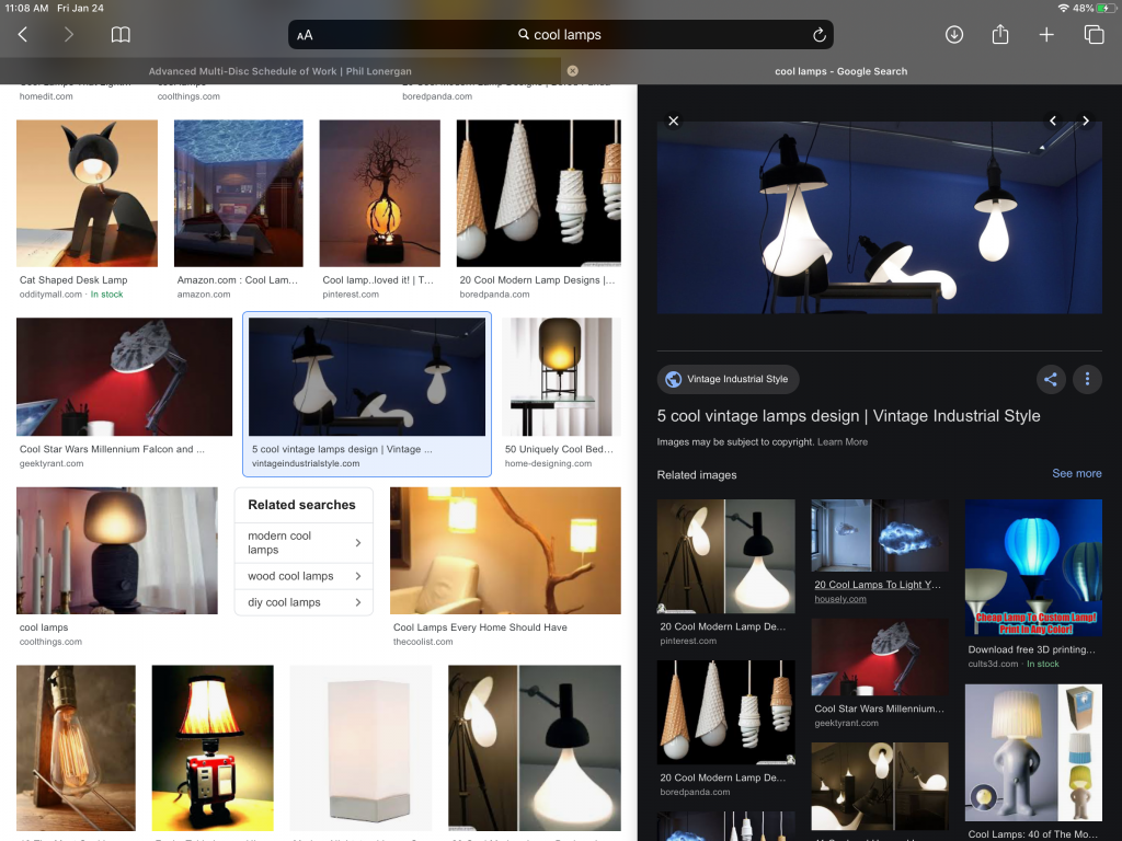
At first, I started by looking at everyday objects whose forms I had a strong Aesthetic response too, while also trying to keep in mind dynamic form. Here were the objects I took inspirations from
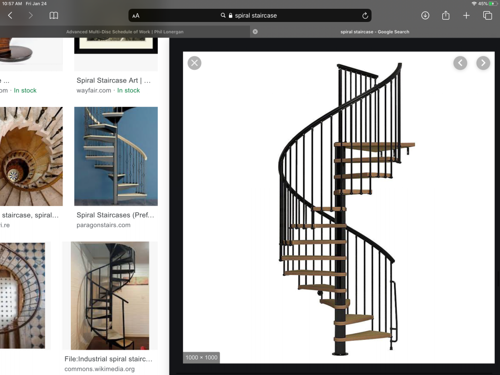
- Spiral Staircase
- Funky lamps
- Cacti
- Cacti flowers
- Stacked rocks
- Kids Abacus toys
I took each item and deconstructed it to its basic shapes and movements then I rearranged and combined them
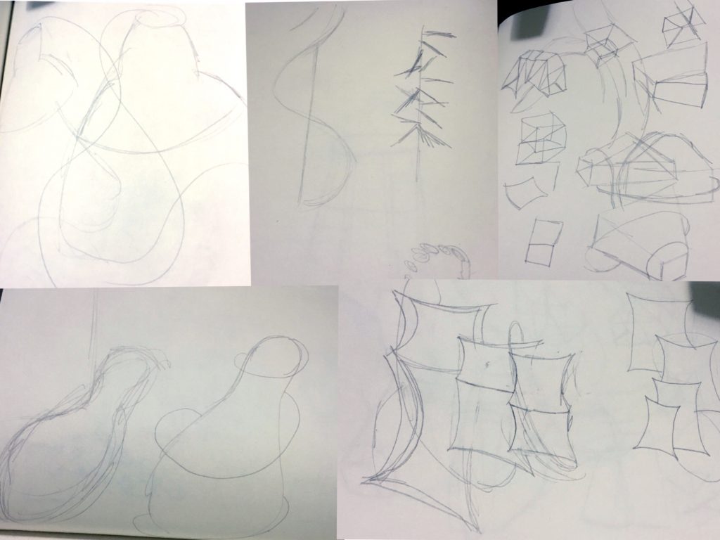
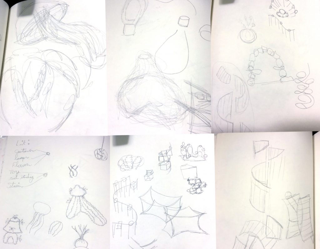
I then created three Maquette’s based off of my deconstructed gestures.
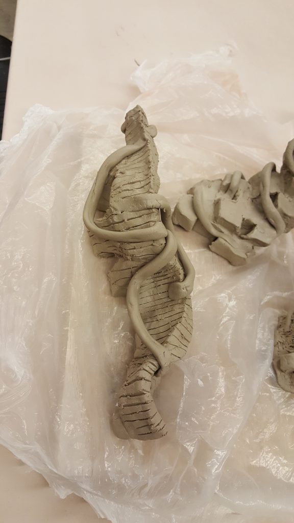
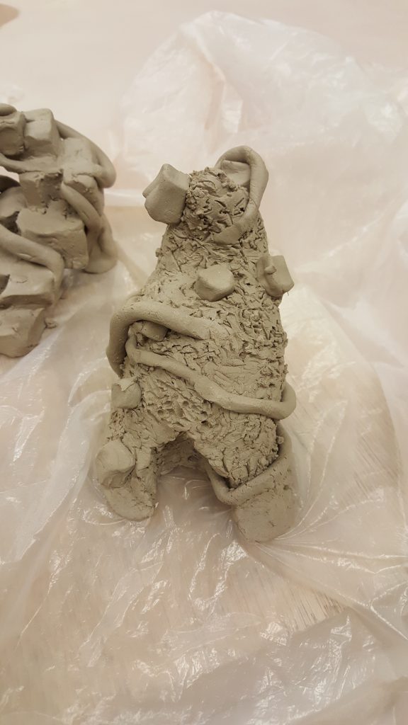
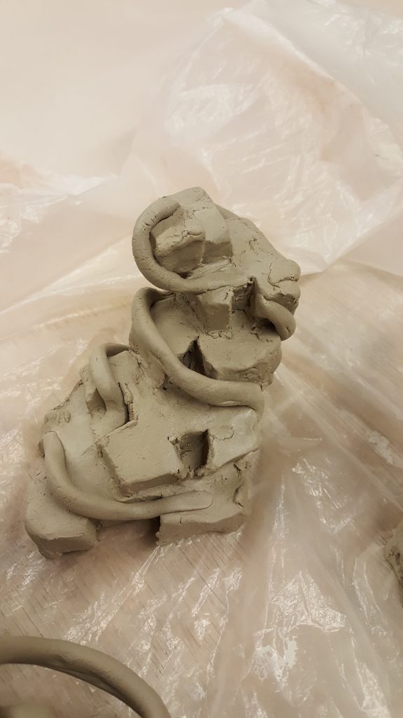
I then participated in a critique and received feedback. Maquette Two was the chosen one, but it had a very flat base that grounded it, so I attempted to go back and recreate it
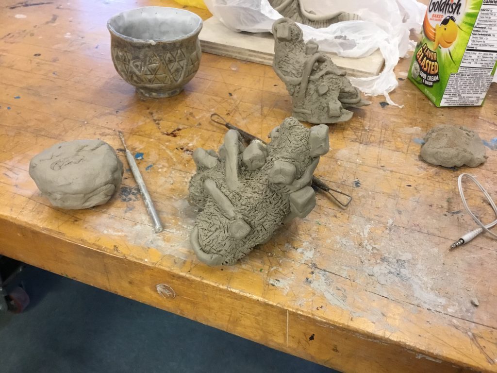
Although This form was created from my objects, the general shape of the lamps, the organic lines from the staircases, the shapes from the abacus, I feel as though I may have subconsciously pulled inspiration from Trenton Doyle Hancock’s Mind of the Mound. As my chosen maquette was very reminiscent of his mounds.
The graphic layering component to this project was another reason I believe Handcock’s work came to mind as a lot of his pieces have many patterns and layers, especially his 2D art.
Once my maquette was done, I began to make the base of my sculpture out of chicken wire and cut out burlap strips to add with the first layer of plaster. As I was doing this on my own, I teamed up with a few peers who were also working on this project, and we began to do material studies with the plaster and experiment.
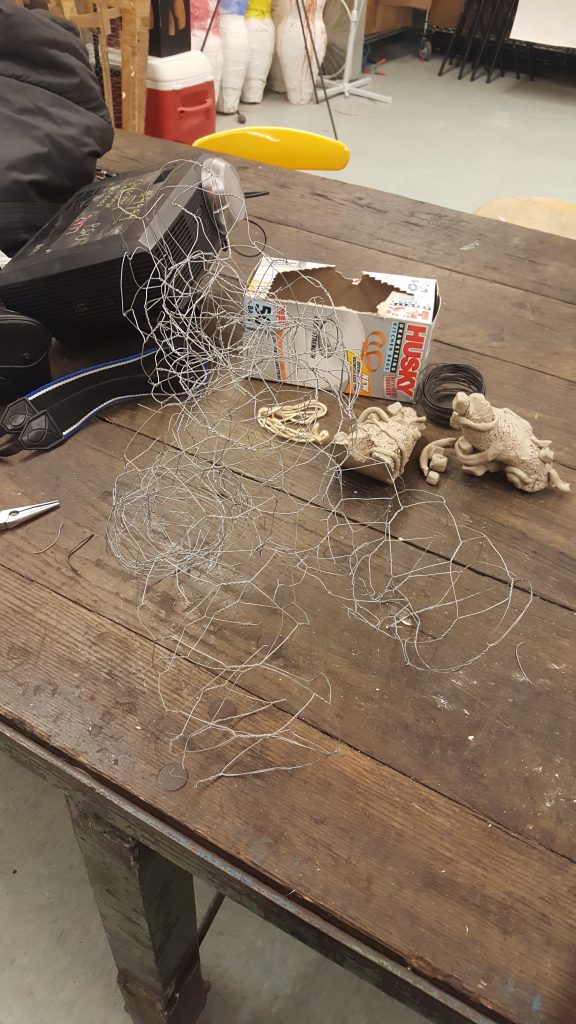
This is where my process for this project took an unexpected turn. While working on this piece, my life outside of my art was completely turned upside down. I was suddenly and unwillingly became very vulnerable. I was left with a lot of complicated and difficult emotions. At first, my reaction to coping with it all was to retreat and I took a two-day break from my life and artwork.
After two days of a break, I switched to the exact opposite and began to stay almost constantly busy. I began to pour myself into my work and started plastering.
First I did a layer of plaster and burlap. then built off of that with plaster. Smoothing and filing down as I went. I ended up going back and rounding the bottom so it was less grounded.
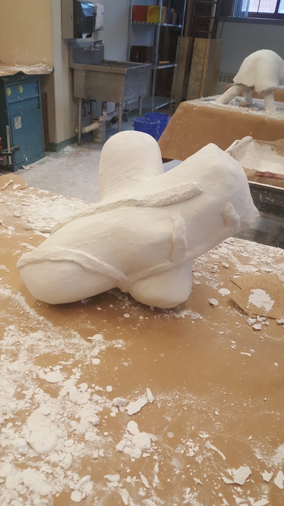
Then I began to add my organic linear elements. As I worked with the plaster a lot more, I began to experiment and I found that the shapes from my maquette did not work well. I also found I preferred a smooth physical texture to the rough one I had tried in the clay.
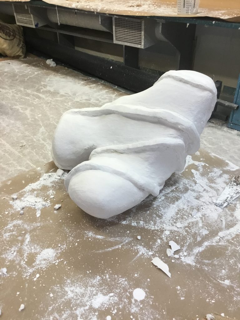
I originally, had my graphic layering designed. But my shift in emotions had made me lose passion for the idea. I went back to the drawing board. Pouring my current emotions into the piece. I’m not sure if this is something Clive Bell would have approved of. It was something definitely out of the norm for me. I usually have every step planned out going into a piece, and I usually try my best to tailor it to the assignment it’s for.
But confined seemed to evolve past that, I no longer cared if the piece was a success, it became more about experimentation, and trying a genre of art to express myself I had never tried before. If I focused more on the pure emotions I felt, and less on what was causing them, is that something I could pour into this piece? Would the viewer be able to look at it, and feel that emotion? Could they look at confined, and not understand the connotations its imagery has for me, but still create a deep aesthetic response?
With this somewhere in the back of my mind, I began to write a list out for graphic layering ideas. My list went as the following:
Graphic combinations:
- Grass texture, plants
- metal/ robotic, wires
- Black and White Obscured bondage, sexual themes
- flesh color
- black bondage straps
- blood
- women in power
- bubble gum
- Bubble Gum B*tch lyrics
- Death Metal Barbie lyrics
- Caution tape
- Feminist artists
I ended up combining the following:
- obscured bondage, sexual themes (black and white)
- black bondage straps (black and white)
- Feminist artists (black and white)
- song lyrics (color)
- bubble gum (color)
From there I gathered pictures from the internet and printed off the lyrics. I had a few specific things I knew I wanted to use. For example, I knew for song lyrics I wanted to use Bubble Gum B*tch by Marina and The Diamonds and Death Metal Barbie by In This Moment.
I also knew I wanted to use Artists Valie Export, Joan Jonas, and the artist group Guerilla Girls.
As for when I was looking for imagery of bondage and female doms, I avoided pictures with men in them, or ones that played into the male gaze to much. I tried to avoid photographs where the model was not looking into the camera, anything that implied something non-consensual, or models in a more vulnerable pose.
After everything was gathered, I began to apply my graphic layers.
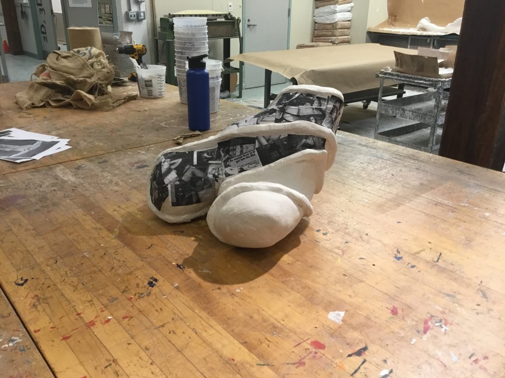
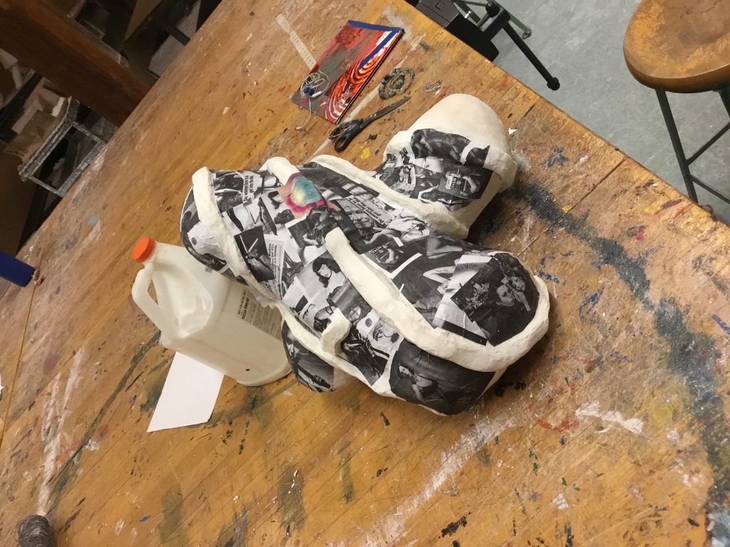
As I began adding my graphic elements, I had an idea of where I wanted things to go, but stuck to this loosely, instead of allowing myself to experiment and see what I thought looked good. It was important to me that the lyrics remained on top, while the rest of the colored imagery blended in a bit more.
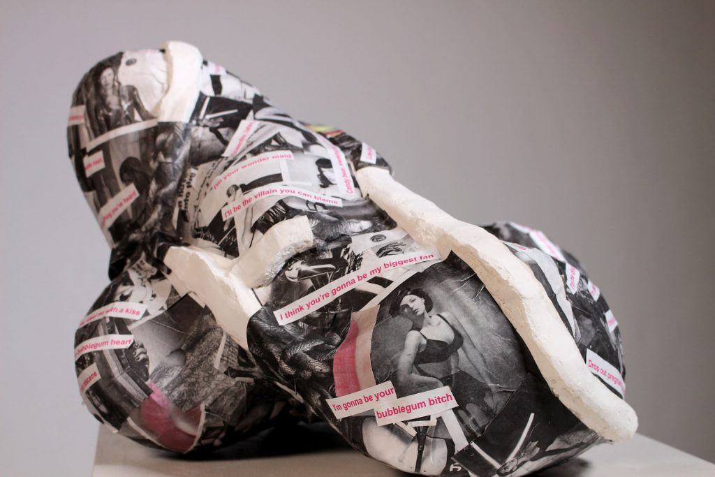
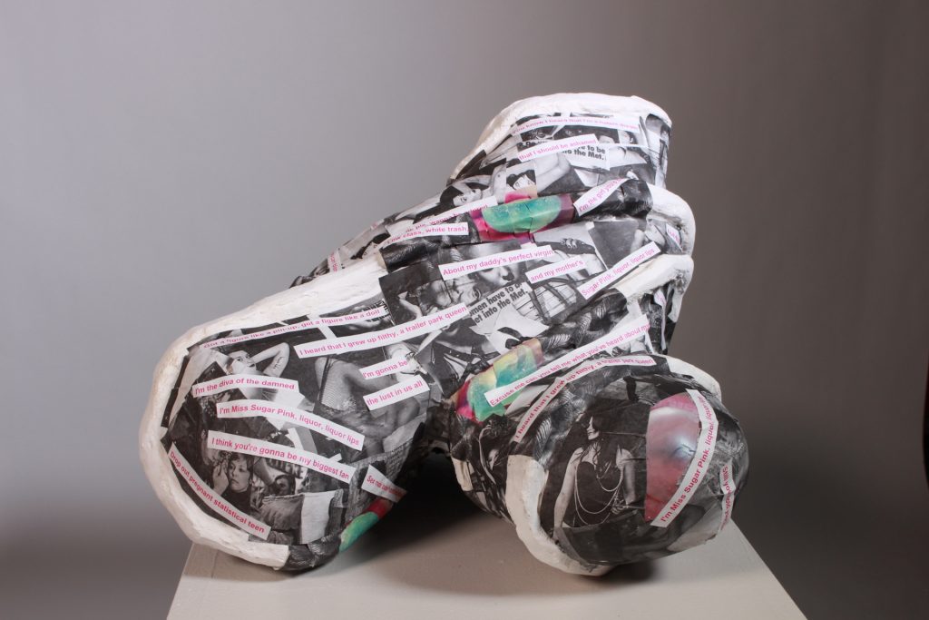
Adding these graphic elements is when this piece started to break away from Clive Bells’ ideology. Adding sexual imagery made my non-representational form a lot more phallus-like from some angles and the hips of a woman from others. Some of the emotions conveyed to the viewer are now through connotation instead of just an Aesthetic Response. I do not think this weakens the piece though as it is still very visually interesting.
Something I would consider doing differently next time would be to print out the black rope in color so that it does not blend in so much with the other layers and maybe having the rope a bright color instead of black. Overall I’m happy with how my piece came out. After talking with my peers about the piece I was happy to find the ideas behind it were conveyed well. Some of them even picking up on the deeper meanings of the piece and not just the surface layer ideas.

4 Responses
Amazing Erin!!! I’m so proud of you!!!
Thank you!!!
Soooooo Proud of YOU!!! ❤️
Thank you!!! Also thank you and everyone else for checking out my website!!!! I built it myself! 🙂